


 by NDenizen Sat Dec 08, 2012 2:32 pm
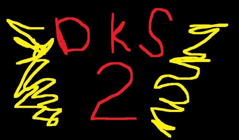
I decided to make a page, simply titled "Dark Souls 2". It's currently a stub of sorts, but it could have interviews and other information added to it as more stuff gets revealed.
Which gets me wondering, what's the plan regarding Dark Souls 2?
Will its information be put on the original Dark Souls wiki, or is a "Dark Souls 2 wiki" being made? Putting both games on one wiki seems bad as it will inevitably lead to confusion (Borderlands wiki is really annoying because of this), but you have to pay for a fully customised new wiki, right?
I'd be interested in helping out, anyway.